For many of us, the internet is obvious. You know where to look, what to click, and how everything works – no matter which website builder or CMS made what you’re looking at. But what if you were one of the one billion people worldwide with a disability, for whom the internet is a lot harder to understand?
Certain disabilities make the internet a more confusing place, and that’s where accessibility comes in.
We’ve looked at some of the world’s most popular websites to discover which ones passed the accessibility tests, and which ones have lots more work to do.
Why does accessibility matter?
Web accessibility affects all of us, in ways we might not even realize. Not only does it make the internet a more usable place for the one billion people worldwide who depend on it, but it also makes it better for everyone else.
It makes text easy to read without us having to squint. It makes it obvious how to complete an order and how to click on a link, and means we can look at our phones first thing in the morning and still understand what’s going on.
For people with specific accessibility needs, it could be the difference between them spending money on a website or choosing to go somewhere else. So for brands, not only does it matter because it makes the website better, it matters because it could be costing them money.
In the UK alone, the amount lost due to inaccessible websites – known as the click-away pound – was £11.75 billion in 2020. That’s billions the economy could be making, if only businesses made a few simple changes to bring their sites up to standard.
How is accessibility scored?
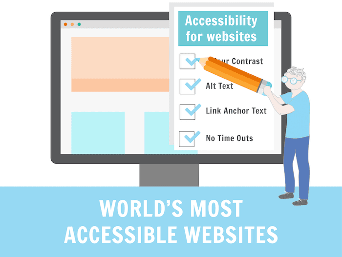
Web accessibility is ranked against the Web Content Accessibility Guidelines, or WCAG. Their current guidelines, WCAG 2.2, tell web owners what they need to do to make their content usable for anyone who might find it.
They score sites in three different categories:
A – The minimum accessibility standards.
You can navigate the site with your keyboard, it won’t lead you into any traps, videos all have captions and no meaning is conveyed by shape, size or colour.
AA – Acceptable accessibility, something sites should aim for.
Colour contrast needs to be at a higher level, images need alternative text that tells blind users what’s in them, navigation will be clear and headings will explain what the content underneath them is talking about.
AAA – The highest levels of accessibility.
Colour contrast needs to be almost black on white, videos need sign language, you won’t ever get timed out of an order, and tooltips are present whenever the content’s purpose needs explaining.
The website accessibility report – who makes the grade?
We ran accessibility tests – more of which you can learn about at the end of this report – on 200 of the world’s most popular websites. These tests looked at everything from colour contrast through to focusable areas, giving us a total score of site assets and how many of those failed.
We used this score to work out what percentage of the site was inaccessible to users with any kind of impairment.
Of course, not all impairments require additional accessibility. For example, wheelchair users won’t need to use screen readers. And while everyone benefits from accessible websites, some internet users need them more than most. Here are a few examples:
Blindness
This is perhaps the most obvious impairment people think of when it comes to accessible content. Blind users can’t read what we write, so they rely on a screen reader to do it for them. They’re also unlikely to use a mouse, instead tabbing through content.
Users with brain conditions
People living with diseases such as Motor Neurone Disease and Parkinson’s suffer with things like shaking muscles, twitches and stiffness. They might find it impossible to use a mouse or click on content, and may use a head wand to navigate sites instead. A head wand is a device that is worn around the head, with a long stick being used to tap the keyboard instead of fingers.
Learning difficulties
Learning difficulties such as dyslexia, or neuro diversities such as autism, can make content very difficult to read. Letters may get jumbled, words may move, and long cases of content might cause headaches or frustration.
Deafness
Deaf people won’t be able to hear any video content, and often young deaf people struggle with reading. Subtitles or sign language will be required on videos, and language should be kept simple.
The internet through other users’ eyes
Good accessibility can not only make your website work better, but it can also make it look better for people who interact with it differently. We’ve mocked up how some of the world’s most popular sites would look if seen by people with visual impairments, letting you see just how much accessibility matters.
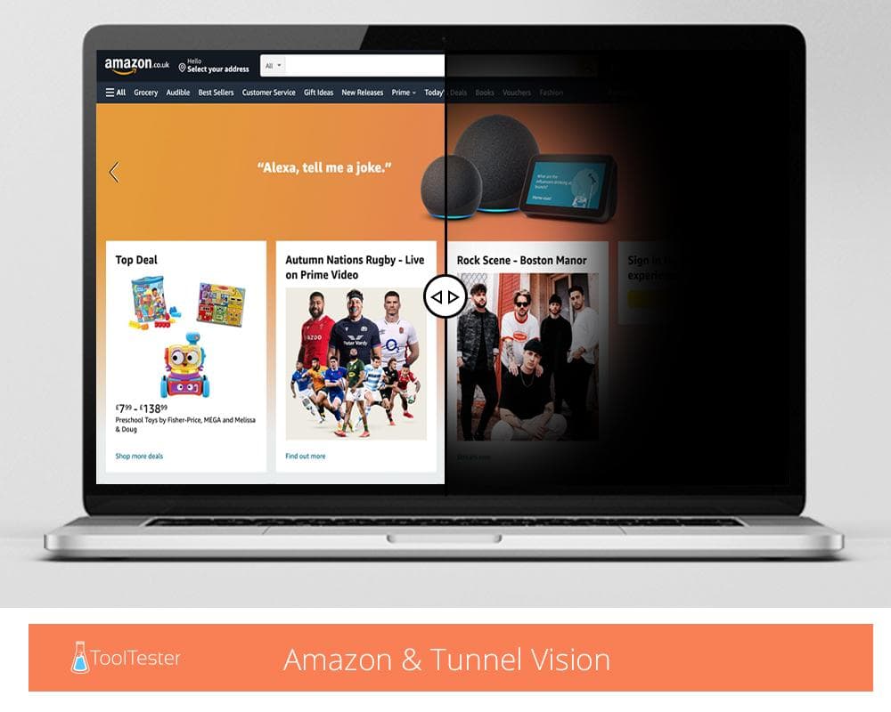
Tunnel vision does exactly what you’d expect – cause people to see things as if looking through a tunnel. On Amazon, this would make a huge amount of products completely invisible, and make it as if any side menus simply weren’t there.
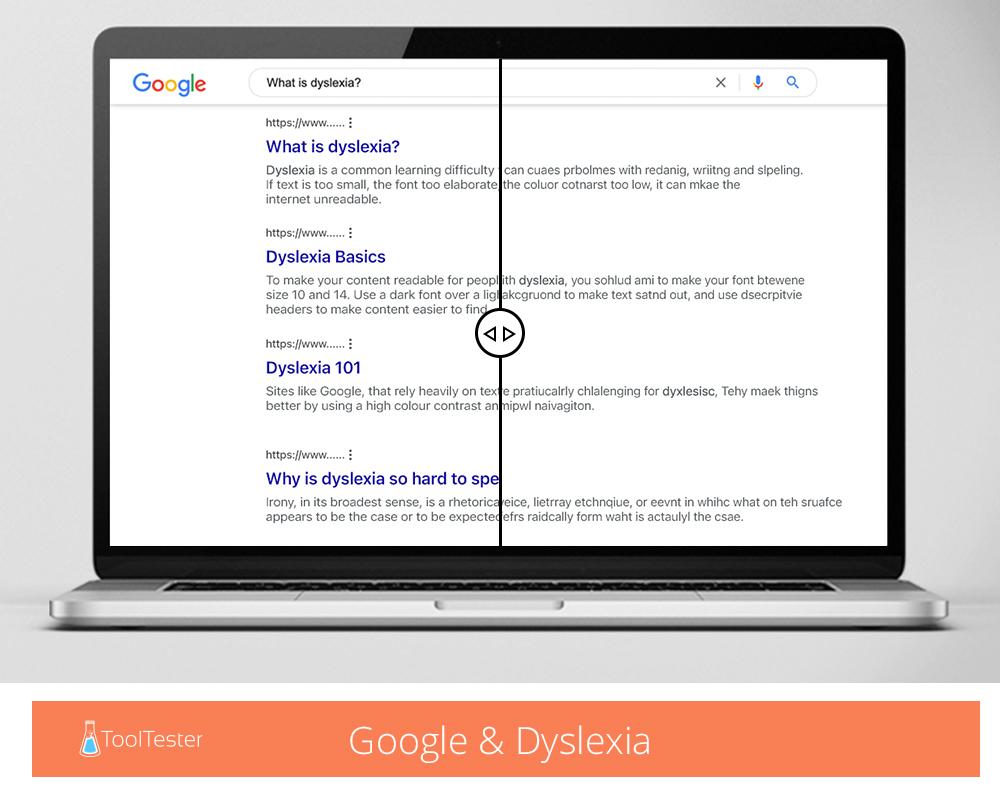
Dyslexia would cause much of Google to look unreadable. It can make reading, writing and spelling a challenge, causing letters to look jumbled up and nonsensical. On a site like Google, where text makes up most of their platform, this would be particularly problematic.
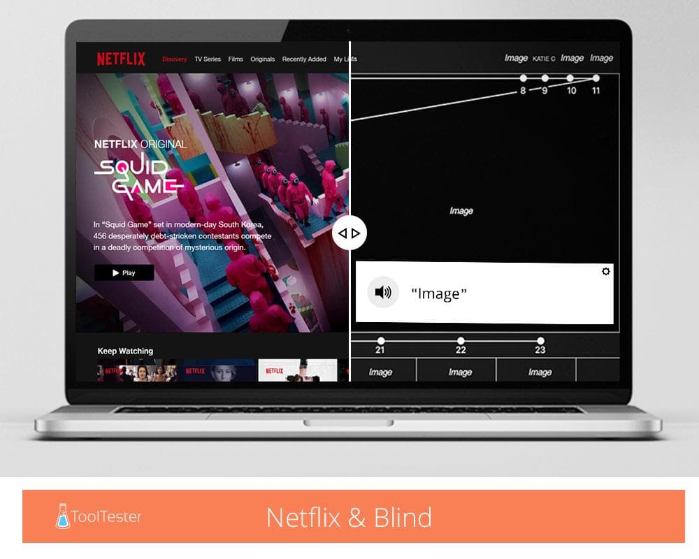
Blindness affects 2.2 billion people worldwide, and would make Netflix look like this. The line you can see illustrates the tab order – how people would navigate the site with the tab key – while the empty image boxes are all people would ‘see’ if not for alt text. The tab order ends at the bottom of the page, giving users no option to go back to the top. Don’t want to watch Squid Game? Tough luck.
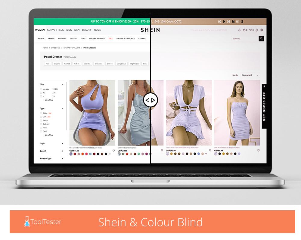
Colour blindness can come in many forms, impacting different colours for different people. While on some sites it might just make things look a little different, if you ever use colour to convey meaning, it would take all that meaning away. We might be able to see that a green button means sign-up and a red button means cancel, but that wouldn’t be as clear to everyone.
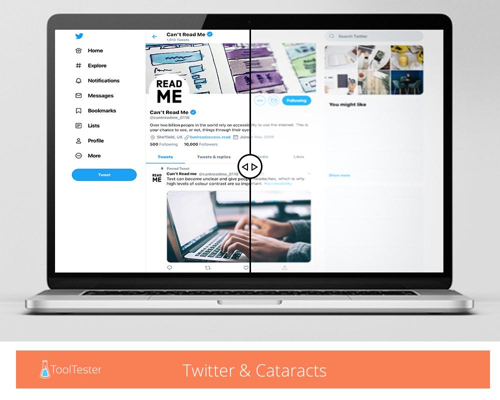
Cataracts make the internet a much blurrier experience. Text can become unclear and give people headaches, which is why high levels of colour contrast are so important. On a site like Twitter, cataracts could leave people scrolling without ever being able to engage.
The most accessible websites
| Site | Total site assets | Accessibility errors | Accessibility warnings | Percentage of site inaccessible |
|---|---|---|---|---|
| Nih.Gov | 555 | 1 | 76 | 0.18% |
| Cdc.gov | 543 | 1 | 59 | 0.18% |
| Gov.uk | 492 | 1 | 14 | 0.20% |
| 295 | 1 | 19 | 0.34% | |
| H&M | 794 | 3 | 160 | 0.38% |
| PayPal | 235 | 1 | 30 | 0.43% |
| Mayoclinic | 750 | 4 | 61 | 0.53% |
| UPS | 607 | 4 | 56 | 0.66% |
| CapitolOne | 448 | 3 | 18 | 0.67% |
| Amazon | 2077 | 15 | 187 | 0.72% |
The National Institute of Health has the most accessible website
The National Institute of Health (NIH), the nationwide body that invests billions into American’s healthcare every year, has the most accessible website on the internet according to our report. Only 0.18% of the site is inaccessible, making it a fantastic resource for the people who rely on it.
Given the audience healthcare websites attract, it’s vital their content is accessible for everyone. The NIH achieves this with a high colour contrast between text and background, descriptive links telling you what clicking them will achieve, and a clear and consistent navigation that makes the site easy to get around.
The only error our tests found was a single case of ‘invalid language specified,’ which is a coding error that might trip screen readers up occasionally. However, as this only appears once across the entire site, it’s unlikely to impact its overall performance.
The Centre for Disease Control and Prevention’s website is 99.82% accessible
Another government health website also scores very highly for accessibility. The Centre for Disease Control and Prevention (CDC) only has 0.18% of its website that is inaccessible to users, making it a clear user experience for all its visitors.
Just like the NIH, this is another website whose target audience is likely to include people with disabilities, making accessible content vital. Its clear design and white background take away any risk of low colour contrast, and also make the navigation simple. Elements are laid out in a way users would expect, all images contain alt text and links are descriptive.
It only falls into second place due to warnings about having links in titles, which may make them slightly harder for people to find.
The UK government website is the third most accessible in the world
The team behind gov.uk – the UK government’s main website – is considered to have invented the term content design, so it makes sense that their website performs so well. Content design is all about how users navigate through content, putting things where people would expect them in a way that’s easy to find. It’s clear that is what’s happened with gov.uk. The website only has 0.20% of features that are inaccessible, with huge amounts of in-depth content laid out well and easy to explore. Again, a white background with black and dark blue text makes for great colour contrast, while descriptive links are available in abundance.
The least accessible websites
Unlike the accessible sites, none of these achieved any accessibility rating. They all failed against WCAG, leaving them with plenty of work to do.
| Site | Total site assets | Accessibility errors | Accessibility warnings | Percentage of site inaccessible |
|---|---|---|---|---|
| ASOS | 276 | 59 | 18 | 21.38% |
| 121 | 25 | 7 | 20.66% | |
| Telegram | 276 | 56 | 24 | 20.29% |
| Smythstoys | 617 | 116 | 119 | 18.80% |
| Costco | 1177 | 218 | 63 | 18.52% |
| Quora | 127 | 23 | 15 | 18.11% |
| Genius | 812 | 144 | 65 | 17.73% |
| Mail Yahoo | 67 | 11 | 3 | 16.42% |
| 254 | 41 | 52 | 16.14% | |
| Shein | 1656 | 267 | 115 | 16.12% |
ASOS has the least accessible website
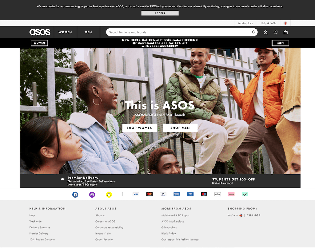
If you’re looking for fast fashion, ASOS has more than most. However, if you have any kind of disability or impairment, there’s a good chance you won’t be able to buy anything. A staggering 21.38% of their website is inaccessible, with errors such as poor colour contrast, text over images and missing ARIA (Accessible Rich Internet Applications) labels making it a difficult experience for any disabled fashion fans.
Missing labels account for the bulk of the site’s issues. Labels aren’t seen by most users, but they allow things like pop-ups and interactive elements to be accessed by anyone using assistive technologies. For example, they’ll show a sales banner or a competition entry form.
At the moment ASOS doesn’t offer enough of them, alienating millions of potential customers.
Update 03 May 2022 – After our study came out ASOS has responded to our report and made improvements to their website. After our team reevaluated the ASOS.com homepage, we did see much better accessibility scores.
Here’s what their new 2022 scores look like:
| Site | Total site assets | Accessibility errors | Accessibility warnings | Percentage of site inaccessible |
|---|---|---|---|---|
| ASOS | 216 | 9 | 18 | 4.17% |
20.66% of Instagram’s login page is inaccessible 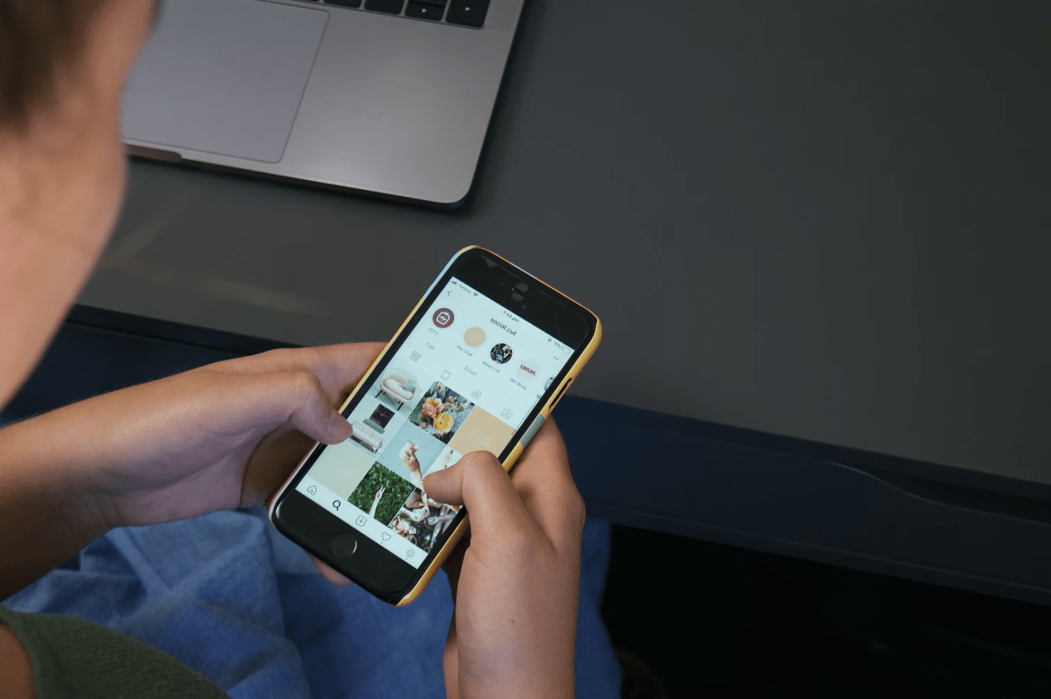
Accessibility score: None
Despite being a fairly simple site with minimal content, Instagram is the second least accessible site on the internet – and that’s before you even log in. Their login page struggles due to a lack of alt text, while changing images mean they have little control over how text appears when overlaid.
13.6% of the Instagram feed can’t be read
Once you get into the app, Instagram continues to struggle. Due to being mostly user-generated content, lots of images appear with no alt text and stories are uploaded with moving text over images – both an accessibility nightmare.
However, there are many problems that Instagram can fix for itself. Low contrast between the site’s font and its light grey background make much of it unreadable, while missing ARIA labels prevent users from seeing play buttons and new story uploads.
Telegram’s login page fails 20.29% of accessibility tests
 Image credit: LoboStudioHamburg (Pixabay)
Accessibility score: None
Telegram classes itself as the social media platform for free conversation, attracting those who feel they’re neglected by regular channels. However, if it wants to attract anyone with poor eyesight, it has work to do. Low colour contrast on its login page is its main issue, making it a challenge for anyone to log in who doesn’t have 20/20 vision.
11.11% of Telegram’s feed is inaccessible
Once you’re in the app, you’ll struggle with images if you’re visually impaired. They contain no alt text, so any blind users won’t pick up their meaning. Zoom is also disabled, stopping anyone from making small font bigger if they need to see things up close.
The most, and least, accessible sites across different sectors
We’ve looked at websites across fashion, banking, e-commerce, entertainment and, of course, website builders, to discover who the best and worst are for accessibility. Some big names have some fairly big issues that need fixing.
LinkedIn is the most accessible social media platform
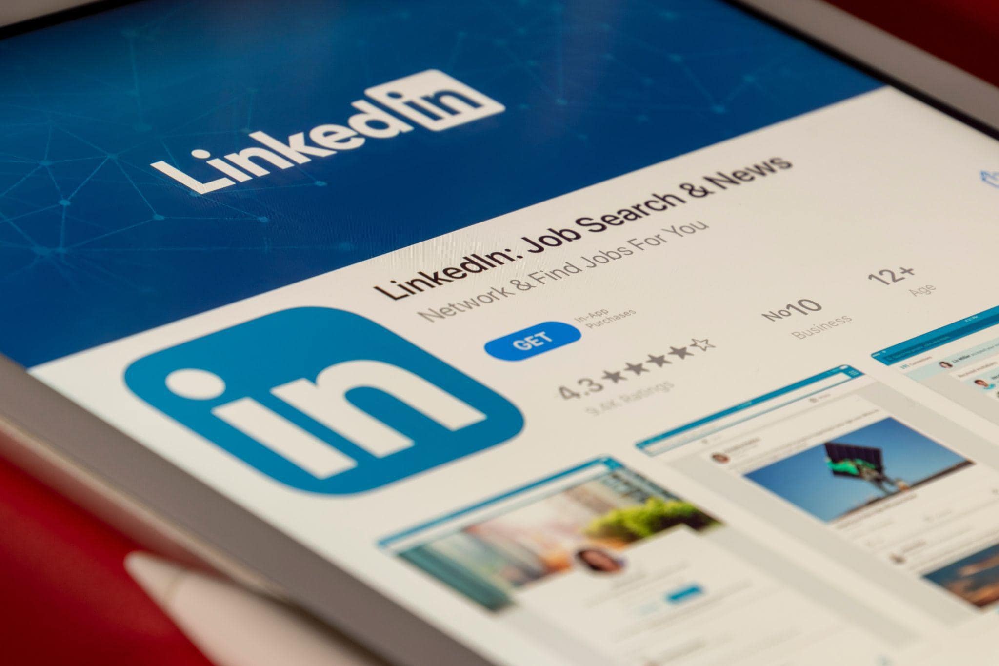
Not only is LinkedIn a good place to find work, it’s also a great place if you use assistive technologies. Only 0.34% of the site’s login screen is inaccessible, as descriptive links, great colour contrast and simple layout make the page easy to move around.
Once you’ve signed in, the accessibility is (almost) just as good. Only 2.94% of the feed fails accessibility tests, as the clear design and consistent navigation make it an easy site to navigate. You can even add alt text to images and documents you upload, showing that LinkedIn really takes accessibility seriously.
LinkedIn narrowly beats Pinterest to top spot. Only 0.95% of the picture-sharing platform’s login page is inaccessible, and 3.19% of their main feed, which is still a great score given how much user-generated content sits on the site.
In third place with 3.76% is Reddit. But while their login page scores well, their actual forum falls flat. 13.98% of that is inaccessible, with user generated content, memes, GIFs and more making it a minefield for assistive technology to work around.
Instagram, Telegram and Facebook all fall foul of accessibility rules
Instagram is the least accessible social media platform to log in to. The image-based app struggles with text readability and optional alt-text on pictures, leaving 20.66% of the login page unusable for 2.2 billion visually impaired people worldwide. The feed is marginally better, but with 13.6% of it inaccessible, it still leaves a lot to be desired.
Telegram, the messaging app comes in second last, with 20.29% of it’s login screen and 11.11% of its feed being inaccessible, leaving Facebook to take the final place on the unreadable podium. Despite being the largest social media platform in the world, attracting 467 million visits every month, 16.14% of its home screen is inaccessible. While the actual feed is much better – only 2.37% fails – if you can’t sign in, you’ll never be able to enjoy it.
The site’s font – white text on a blue background – is just the start of its problems. It doesn’t meet the minimum requirements for colour contrast, doesn’t enforce alt text on image uploads, and has several missing ARIA labels leaving it difficult for some users to navigate.
The social media platforms with the most accessibility issues
| Site | Total site assets | Accessibility errors | Accessibility warnings | Percentage of login page inaccessible | Percentage of feed inaccessible |
|---|---|---|---|---|---|
| 121 | 25 | 7 | 20.66% | 13.60% | |
| Telegram | 276 | 56 | 24 | 20.29% | 11.11% |
| 254 | 41 | 52 | 16.14% | 2.37% | |
| Tiktok | 305 | 36 | 83 | 11.80% | 14.56% |
| 212 | 21 | 28 | 9.91% | 10.21% | |
| 167 | 8 | 9 | 4.79% | 6.70% | |
| 4125 | 155 | 638 | 3.76% | 13.98% | |
| 734 | 7 | 13 | 0.95% | 3.19% | |
| 295 | 1 | 19 | 0.34% | 2.94% |
Amazon Prime Video is the most accessible entertainment site
Not only do entertainment sites need subtitles and audio descriptions to make their content accessible, they also need to ensure shows are easy to find and play. Amazon Prime Video does this better than anyone, as only 0.72% of the login page – and 0.59% of the main site – is inaccessible. It uses a clear tab order to allow users to navigate through every section, light font on a dark background, and descriptive links.
It beats competition from HBO Max – 1.4% login page and 1.35% main site inaccessible – and Twitch, the game streaming site, which scores 1.4% for its login page and 2.19% for the main site . Netflix, one of Prime Video’s leading rivals in the entertainment space, comes in some way back. While its login page does very well, with only 0.27% failing the tests, 1.79% of its main site doesn’t pass.
SoundCloud is the world’s least accessible entertainment site
![]()
While SoundCloud might let you listen to music for free, it comes at a cost for any disabled users. 31.42% of the site’s login page is inaccessible, suffering with 66 instances of text being used over a background image, making it difficult to read. It also lacks ARIA labels, form IDs and descriptive links, which won’t be music to anyone’s ears. Things don’t get much better when you’ve signed in, as 14.92% of the content remains out of reach.
Steam is second in the bad books. The site allows users to play games online, but with no alt text on images, text over background images and numerous text formatting issues, they need to take accessibility a little more seriously – 12.90% of the home page and 9.53% of content is currently off limits.
Roblox comes in third. The online game is great for kids, unless those kids have certain impairments. 6.29% of the site’s login page is inaccessible, in particular its forms which lack labels or tooltips. Without form labels, visually impaired users won’t know what information to put where, meaning they won’t be able to join in the fun. While the main site improves drastically with a score of 1.13%, all that content is wasted on users who can’t ever get to it.
The entertainment sites with accessibility issues
| Site | Total site assets | Accessibility errors | Accessibility warnings | Percentage of login inaccessible | Percentage of site inaccessible |
|---|---|---|---|---|---|
| Soundcloud | 476 | 71 | 99 | 14.92% | 31.42% |
| Steampowered | 1070 | 102 | 334 | 9.53% | 12.90% |
| Roblox | 159 | 10 | 15 | 6.29% | 1.13% |
| play.google | 1430 | 87 | 177 | 6.08% | 5.46% |
| Hulu | 682 | 30 | 160 | 4.40% | 8.5% |
| Spotify | 187 | 6 | 10 | 3.21% | 2.19% |
| Apple | 668 | 17 | 68 | 2.54% | 4.30% |
| Nowtv | 1160 | 28 | 222 | 2.41% | 4.60% |
| Netflix | 279 | 5 | 30 | 1.79% | 0.27% |
| Disneyplus | 234 | 4 | 14 | 1.71% | 8.38% |
| Youtube | 3180 | 53 | 2071 | 1.67% | 1.28% |
| Twitch.tv | 786 | 11 | 120 | 1.40% | 2.19% |
| Amazon Prime | 2077 | 15 | 187 | 0.72% | 0.59% |
Amazon’s accessibility leads the way in e-commerce
![]()
Amazon’s retail site is the most accessible on the market, as only 0.84% of it failed our tests. The site benefits from a white background and dark text, while also offering a whole host of descriptive links and menus for users to click on. The user journey is also incredibly efficient, letting people add things to their basket and checkout fast, preventing the risk of any overly-hasty timeouts.
Dunelm is the second most accessible e-commerce site. Only 1.01% of the furniture retailer’s site is inaccessible, making the user journey just as comfortable as the products they sell. Even though the site does use text over images, it highlights it in a clear way, allowing it to provide accessible features without sacrificing any style.
Xfinity comes third in our list. The internet provider’s site is only 1.08% inaccessible, offering a crisp, white background for all its content to live on.
Smyths Toys is the least accessible e-commerce site
With a mix of white font on a light blue background, non-descriptive buttons and varying font sizes, it’s no surprise that Smyths Toys’ site is 18.80% inaccessible. Buttons that say ‘shop now’ mean nothing out of context, so anyone tabbing through the content is unlikely to stop and click them.
Unsplash is the next worst. 15.56% of its site is inaccessible, a problem reinforced by the sheer amount of imagery with no alt text. The platform is a great place for photographers and designers to share their work, but text over images and a confusing tab order make it a bad experience for any impaired users.
Halfords takes the unwanted third spot. While the site might be a fantastic place for car parts, it’s a bad spot for colour contrast, giving it an inaccessible score of 9.56%.
The best and worst e-commerce sites for accessibility
| Site | Total site assets | Accessibility errors | Accessibility warnings | Percentage of site inaccessible |
|---|---|---|---|---|
| smythstoys.com | 617 | 116 | 119 | 18.80% |
| halfords.com | 1057 | 101 | 159 | 9.56% |
| argos.com | 674 | 51 | 154 | 7.57% |
| shutterstock.com | 963 | 70 | 44 | 7.27% |
| autotrader.com | 848 | 55 | 100 | 6.49% |
| homedepot.com | 1939 | 122 | 220 | 6.29% |
| johnlewis.com | 676 | 42 | 64 | 6.21% |
| wayfair.com | 490 | 28 | 25 | 5.71% |
| ikea.com | 545 | 29 | 47 | 5.32% |
| diy.com | 497 | 22 | 52 | 4.43% |
| therange.com | 917 | 29 | 190 | 3.16% |
| next.co.uk | 750 | 23 | 151 | 3.07% |
| boots.com | 1286 | 39 | 394 | 3.03% |
| screwfix.com | 1861 | 46 | 987 | 2.47% |
| att.com | 648 | 14 | 110 | 2.16% |
| lowes.com | 738 | 14 | 110 | 1.90% |
| ebay.com | 983 | 17 | 101 | 1.73% |
| etsy.com | 1198 | 14 | 190 | 1.17% |
| xfinity.com | 558 | 6 | 81 | 1.08% |
| dunelm.com | 496 | 5 | 32 | 1.01% |
| amazon.com | 2514 | 21 | 141 | 0.84% |
Thursday is great for accessible dating

If you’re looking for love with a disability, Thursday could be the dating app for you. However, no dating site scores especially well. 6.50% of Thursday is inaccessible, a score that could be improved by removing the text from images and increasing the colour contrast.
Tinder comes in second with a score of 6.77%. Dark grey font on a light grey background is never going to lead to a very accessible site, but apart from that, it does ok. A tentative swipe right from us.
Coming in third with 8.27% of its site being inaccessible is Grindr. It’s a bright yellow site with bold, black text, making it highly readable and easy to engage with.
14.34% of Bumble is inaccessible
While Bumble might have revolutionised the internet dating scene, creating an app in which only women can speak first, it’s got some way to go before it has a truly accessible platform. As it stands, 14.35% of its site is unusable for anyone with an impairment. It lacks descriptive links and buttons, and worst of all, uses white font on a yellow background.
That’s hard to read even with perfect eyesight.
Only slightly better, with 13.93% of its site being inaccessible, is eHarmony. One of the original dating sites is still a little behind the times when it comes to accessible content, with text over moving images being a nightmare to read. On top of that, the tiny, light grey font doesn’t make things much easier.
The dating sites who’ve met their accessible match
| Site | Total site assets | Accessibility errors | Accessibility warnings | Percentage of site inaccessible |
|---|---|---|---|---|
| Thursday | 431 | 28 | 72 | 6.50% |
| Tinder | 251 | 17 | 17 | 6.77% |
| Grindr | 133 | 11 | 13 | 8.27% |
| Match | 713 | 69 | 98 | 9.68% |
| eHarmony | 689 | 96 | 107 | 13.93% |
| Bumble | 251 | 36 | 31 | 14.34% |
GoDaddy is the best website builder for its site accessibility
Now onto our specialist subject, website builders. GoDaddy is certainly one of the biggest, and when it comes to its website’s accessibility, it’s also the best. Only 2.11% of its site is inaccessible, making it easier to use than Wix, with 3.61%, and Weebly, with 8.49%.
All of these sites offer good usability and clear navigation, making it easy for customers to navigate their services whatever level of ability they have.
WordPress and Squarespace are the least accessible website builders
Despite being two of the major players in the market, both WordPress (10.22%) and Squarespace (9.33%) struggle with accessibility. Both have issues for area focussing, which allows users with low vision to zoom in on sections and read content up close. It can also help people who can’t use a mouse stay on content for long enough to take it in.
On both these sites, focus is a problem, while low colour contrast and missing ARIA labels add to their total scores.
The website builders that need to build their accessibility scores
| Site | Total site assets | Accessibility errors | Accessibility warnings | Percentage of site inaccessible |
|---|---|---|---|---|
| WordPress | 1379 | 141 | 202 | 10.22% |
| Squarespace | 686 | 64 | 66 | 9.33% |
| Weebly | 377 | 32 | 31 | 8.49% |
| Wix | 1054 | 38 | 88 | 3.61% |
| Godaddy | 522 | 11 | 41 | 2.11% |
H&M, Nike and Nordstrom all look good for accessibility
Fashion sites like H&M, Nike and Nordstrom all make it easy for users to access their products, with sites designed to be accessible. H&M is one of the best scorers in our whole report – only 0.38% of its site is inaccessible, and that mainly comes down to a couple of missing ARIA labels.
Nike is also good – only 1.68% of its site failed our tests. They use black font over a light background, and put alt text on their images. If they sorted out their ‘shop’ buttons, they’d score even higher. Naming the product in the button increases readability, and is also likely to increase the number of people clicking it.
Only 2.13% of Nordstrom’s website is inaccessible, again benefiting from good colour contrast and a simple layout.
ASOS isn’t the only fashion accessibility offender
While ASOS is the least accessible website in our whole survey, it isn’t the only fashion site to fall the wrong side of the regulations. 21.38% of its site is inaccessible, only slightly worse than Shein with 16.12%. The European fashion site has a very busy homepage, making it hard for users to find where they’re going and difficult for anyone to read.
The amount of pop-ups is also challenging. The best screen readers can deal with them, but some will get stuck on them and prevent customers from browsing any of the products.
The fashion sites not sitting pretty with accessibility
| Site | Total site assets | Accessibility errors | Accessibility warnings | Percentage of site inaccessible |
|---|---|---|---|---|
| ASOS | 276 | 59 | 18 | 21.38% |
| Shein | 1656 | 267 | 115 | 16.12% |
| Zara | 760 | 55 | 137 | 7.24% |
| GAP | 1405 | 67 | 109 | 4.77% |
| Kohls | 1332 | 54 | 218 | 4.05% |
| Macys | 440 | 11 | 55 | 2.50% |
| Nordstrom | 750 | 16 | 80 | 2.13% |
| Nike | 831 | 14 | 62 | 1.68% |
| H&M | 794 | 3 | 160 | 0.38% |
Gmail is the most accessible email provider
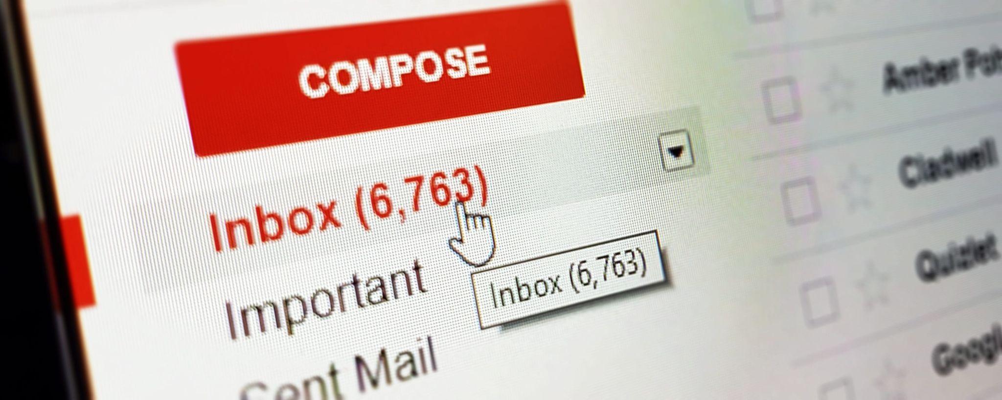
Email inboxes should be fairly straightforward. A blank background, obvious headings and clear links make opening and replying to emails easier, especially if Gmail is your main provider. Google’s mail platform only has 3.17% inaccessible features, with the majority of its errors coming via poor ARIA labeling, making certain elements unclear if you use assistive technology.
Gmail scored well for colour contrast and readability. Black text on a white background couldn’t be any easier to read, and an uncluttered inbox makes messages easy to navigate.
It just beats live.com, whose site has 3.84% inaccessible features. That’s a huge improvement from Live’s predecessor, MSN Messenger, where emojis, bubble text and vibrating chats made it difficult for all but the most committed 2000s teens to understand.
Yahoo has work to do to make its site accessible
One of Gmail’s biggest competitors in the email industry lets itself down when it comes to accessibility. 16.42% of their email inbox is impossible to access for impaired users, meaning many emails will go unopened. Black text on a dark grey background is difficult to read, text over imagery can be confusing, and the huge amount of ads that pop up while you’re trying to access your inbox could cause some screen readers real problems.
The email providers proving hard to read
| Site | Individual Assets | Errors | Warnings | Percentage of site inaccessible |
|---|---|---|---|---|
| Yahoo | 67 | 11 | 3 | 16.42% |
| Live.com | 365 | 14 | 72 | 3.84% |
| Gmail | 3178 | 101 | 379 | 3.17% |
The most common accessibility issues
Some accessibility issues appear more often than others. While it’d be ideal if every video on every website had sign language, we understand that’s not something everyone will have the budget for. However, all of these common issues are easy to fix, and could help your business keep more customers and make more money.
Colour contrast
When putting text over a coloured background, it needs to be of a high enough contrast to stand out. Lots of sites fall into the trap of choosing style over function, putting coloured fonts over coloured backgrounds that run the risk of becoming invisible.
No alt text on images
Alt text is what people with visual problems rely on when looking at images. It’s what their screen readers will read out to describe what the image shows, so it could be anything from, “Cat sitting on a box” through to “Green button-up dress in size 12”. If you don’t use alt text, millions of people won’t notice any of your pictures.
Missing link anchor text
Anchor text is the text a link lives in. For example, if we wanted to link to our website builder reviews, the words ‘website builder reviews’ would be the anchor text. If you don’t use anchor text, and instead just put the full URL in your content, it can be harder for screen readers to read, and it looks less inviting for people to click on.
Undescriptive anchor text
Anchor text should say what clicking on it will achieve, or where the link will take you. Not only does this build trust, but it also improves the user experience. If a link tells you what clicking it will do, you’re more likely to click it.
Undescriptive links say things like ‘learn more’ or ‘click here’. If you’re just skimming the page and see those links out of context, you won’t understand what they’re for, and you probably won’t engage with them.
Too many navigation links
A drop-down menu that reveals a few different options is the way we navigate around most websites. However, if the menu gives you too much choice, it can be impossible to figure out where you should go and what you should click.
Think of it like a menu at a restaurant: A clear, simple menu will make your food order easy. A menu with hundreds of meals on it will overwhelm you, and make you doubt how good the food actually is.
Empty form labels
When filling in a form, it helps to know what should go in each box. We normally see this on check-out pages when you’re giving a business your address. If these forms are left empty, anyone with a visual disability might not know what information to put where.
Time-outs can’t be stopped
Lots of websites will time you out if you don’t complete your order on time. You might see a screen that says, ‘Sorry, your session has been timed out,’ leaving you to start all over again.
That’s annoying for everyone, but especially if it naturally takes you longer to do things online. People who can’t use a mouse, or who can’t read, or can’t see, will take longer to perform the same actions, making time-outs impossible to beat and sites impossible to use.
Want to make sure your website appeals to more people?
We compare the best website building tools to help you create a site that delivers results. Whether you want a beautiful creative portfolio or a multi-level, highly secure product purchasing platform, we can help you find the website builder that will do the job you need.
Just remember to check our accessibility tips to ensure you don’t alienate one billion people.
Methodology
The study used the chrome extension ‘Arc Toolkit’ to check the accessibility of over 150 websites. The tool looks at individual assets, errors and warnings which are all used to rank how accessible websites are. To keep the study fair, we based the ranking on the percentage of errors of the homepage to find the most and least accessible websites. For the social media and entertainment websites which make you log in first, we examined the accessibility of the login pages and then analysed the home pages separately (the feeds) to keep the study consistent with the other sectors which take you straight to the homepage.
Disclaimer: When looking at social media feeds, not everything that is posted by individuals can be controlled by the social media sites hence why errors could be higher for the deep dive analysis. However, these sites can make an effort to encourage users to add things such as alt-text to their images, making the site more accessible for all. Our report looked at both the home pages and feeds, as users will need to sign in before they can do anything else.
The most popular websites collected from data by Similarweb. Find our data sources here.
This post was originally published in November 2021 and has been updated on May 3, 2022.
The authors
Learn more about us

THE BEHIND THE SCENES OF THIS BLOG
This article has been written and researched following a precise methodology.
Our methodology